Documentation

This documentation is valid for the latest version of PlotDigitizer Pro. If you are using the free online app or an outdated version, you might experience some inconsistencies in the documentation.
Table of contents
- General guide
- Layout
- Uploading the image to PlotDigitizer
- Image file formats
- Selecting graph type
- Calibrating the graph
- Extracting data points manually
- Select/move/delete a single data point
- Select/move/delete multiple data points
- Exporting the extracted data
- Types of graphs
- Axis scales
- Autotracing
- Image editing
- Datasets
- Export
- Settings
General guide
The general guide explains all the basic instructions to get started with PlotDigitizer.
Layout
The below image is the first view of the app. It consists of the top menu bar, zoom panel, scale panel, dataset panel, and main view.
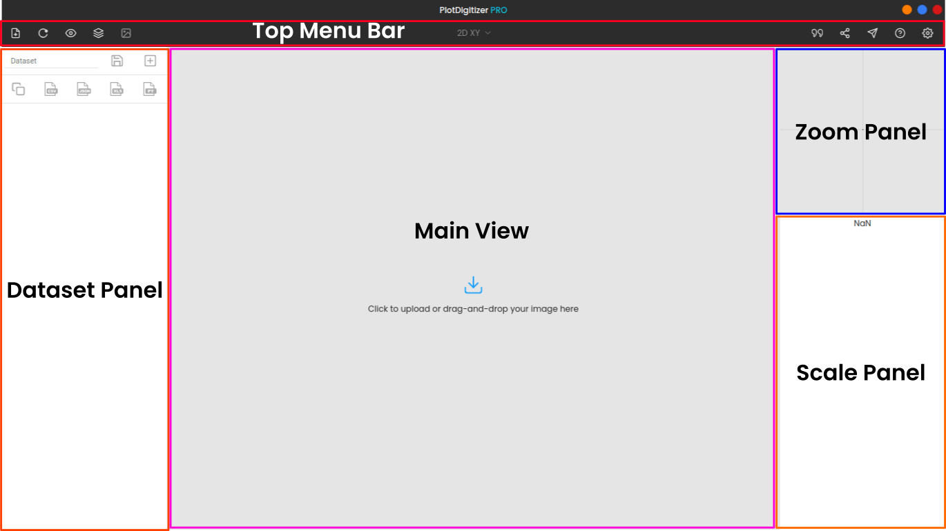
- Top menu bar: The top menu bar lists all the major controls and gives access to primary functions.
- Main view: This is where the graph image is displayed.
- Zoom panel: The zoom panel magnifies the portion of the image around the cursor.
- Dataset panel: The dataset panel displays the extracted data from the graph.
- Scale panel: It allows you to select the axis type and calibrate the plot.
Top menu bar
Below is the list of elements (from left to right) in the menu bar.

- Click to upload the image file
- Reloads the entire app, and clears all ongoing work
- Show/hide scale: Show/hide the calibration markers
- Datasets: Access the saved datasets
- Image editor: Edit, crop, rotate, scale, or flip the image or apply an image filter
- Color picker: Pick the color of the curve or points that you want to autotrace
- Masking: Add mask onto the portion of the image
- Tracing: Automatically extract data values from the graph
- Select the type of the graph
- Cite the app
- Share the app on social media
- Report a bug or send a feedback to us
- Get help
- Settings: Explore other options
Zoom panel
The zoom panel is like a magnification glass, and it magnifies the portion of the image around the cursor. It is useful for improving the precision of a data value while selecting and dropping a marker.
When you are calibrating the graph or manually extracting data, you will find the zoom panel very helpful.
You can change the level of magnification from settings (gear icons at the top, right corner).
Cursor position: The coordinates of the cursor are displayed beneath the zoom panel.
Scale panel
The scale panel varies slightly depending upon the graph type, but two prime elements in the panels are axis type and its input field.
Axis type: This option gives users to select the type of axis they are calibrating. The possible choices include linear, data/time, log base 10, log base e, reciprocal, angle, radian, percent, and fraction.
Input fields: In the input fields, you have to enter the numerical values of the calibrating markers. Again, this might change for different graph types.
Entering numerical values in the input fields is not necessary, instead, you can enter mathematical expressions. For example, you can enter 7/2 , instead of 3.5; read the math parse section of this documentation to know more about it. For date/time, there is an integrated data/time picker.
Dataset panel
The dataset panel shows all the extracted data values of the graph in a tabular format.
Besides the table, there are some additional functionalities, e.g., save dataset, quick export options. The list is below.
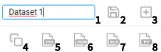
From left to right and top to bottom, the descriptions of the elements in the above image is as follows:
- Enter the name of the dataset name
- Saves the extracted data values. The saved datasets can be viewed from the “view dataset” icon on the top menu bar.
- Creates a new dataset
- Copy the extracted data to the clipboard
- Export the extracted data to CSV
- Export the extracted data to JSON
- Export the extracted data to MS Excel
- Export the extracted data to Python list
For more export options, click on the “view dataset” option on the top menu bar.
Uploading the image to PlotDigitizer
You can upload the image to PlotDigitizer by clicking on the upload icon on the top menu bar or by drag-and-dropping the image in PlotDigitizer.
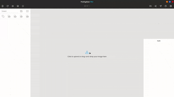
Image file formats
PlotDigitizer supports all common image file formats; the current list is JPG/JPEG, PNG, GIF, WEBP, BMP, SVG, and SVGz.
Selecting graph type
Once you upload the image to the software, you can change the graph type according to your graph. By default, the graph type is XY.
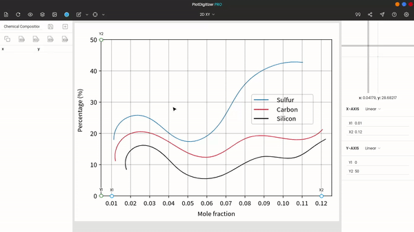
Calibrating the graph
After selecting the graph type, the next step is to calibrate the graph. Depending upon the graph type, you have to calibrate one or more axes.
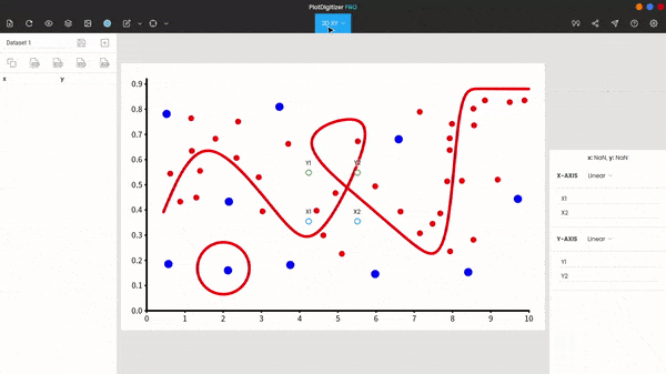
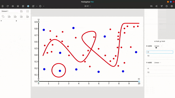
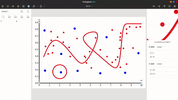
In the case of the XY graph, you have the X-axis and Y-axis. Move the calibration markers, (X1, X2, Y1, & Y2 on the main view) to known positions on the graph image.
Note 1: You can move the markers to any known positions. Placing the markers on the axes of the graph image is not necessary. The markers can be placed at the known position other than the axes. For example, X1 does not necessarily have to be placed on the X-axis, but it can be drag-and-dropped to any point on the graph where its X-coordinate is known.
Note 2: For better accuracy, it is recommended that you pick calibration points as far as possible.
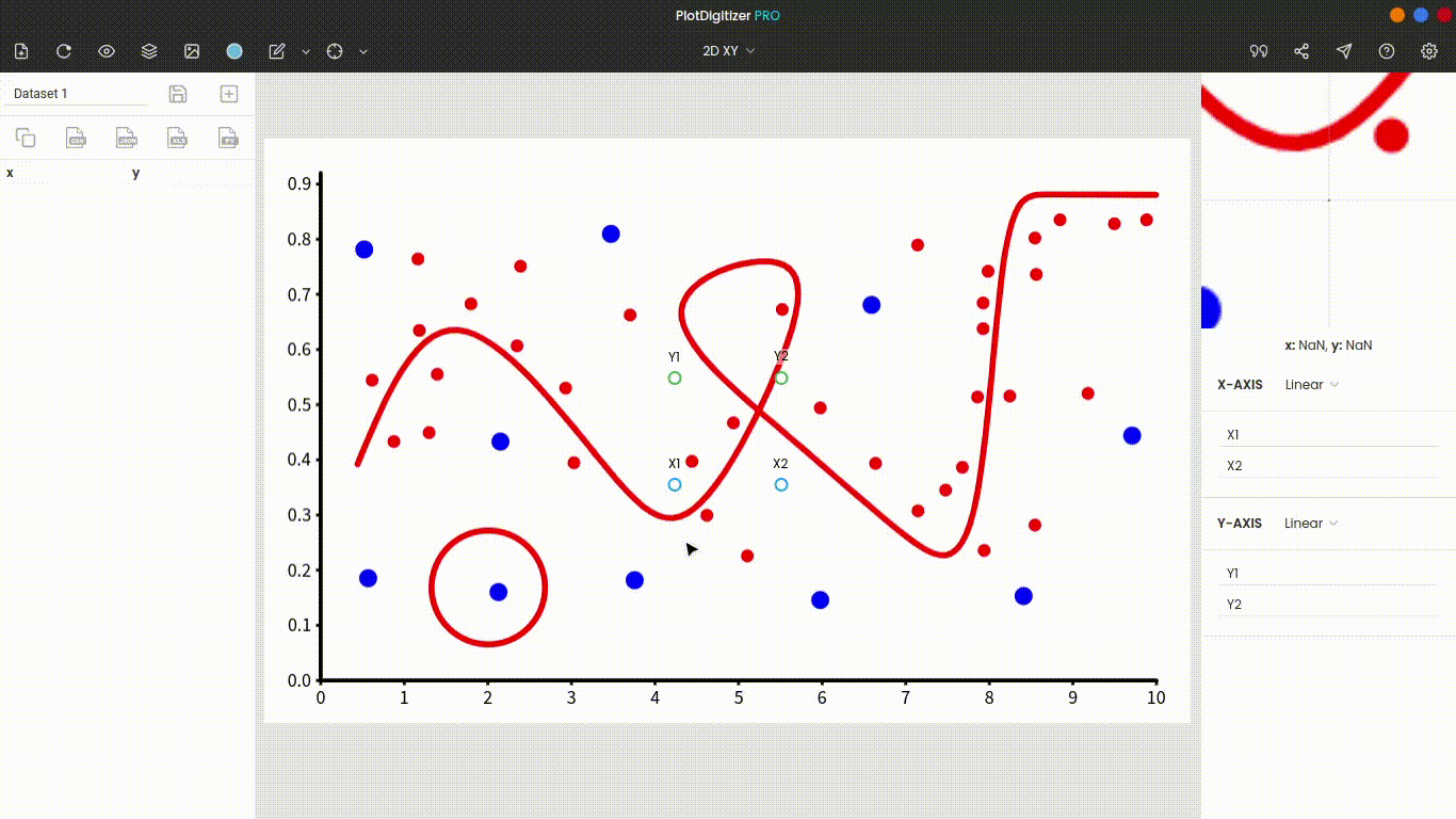
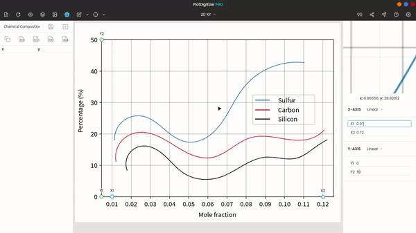
Now, you have to select the correct axis scale. PlotDigitizer offers support for both linear and nonlinear scales (date/time, logarithmic, reciprocal).
After selecting the scale, enter the appropriate values for the markers (X1, X2, Y1, & Y2 in the case of XY) in the input fields. The input fields can parse and evaluate mathematical expressions. For example, instead of entering the numerical value “0.0006,” you can enter “6*10^-4.” To find more on the input syntax, go to the “Math parser” section of this documentation.
You can change the calibration at any time even after extracting data; the data gets automatically updated.
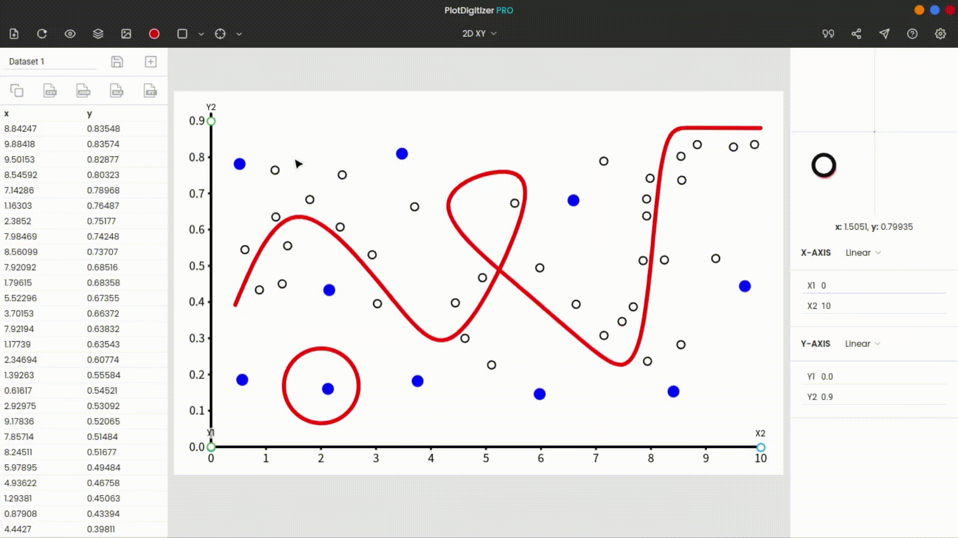
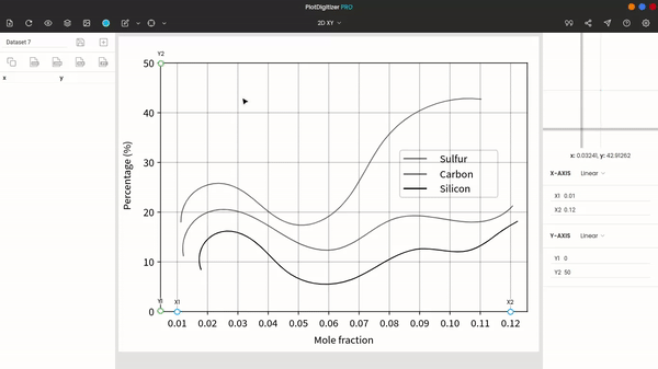
Extracting data points manually
To mark a data point, click on the position on the image. And its corresponding data values (or coordinates) get generated on the dataset panel.
Further, you can move the generated points anytime by click-and-drag to a new position. The data values of points at new positions are updated automatically.
Select/move/delete a single data point
To select a single data point, click and hold on the point. If you are using a mouse, use the left-click.
The selected point can be moved and dropped by dragging and releasing the click.
You can delete a single data point by right-clicking on it.
Select/move/delete multiple data points
To select multiple data points, click (left-click for the mouse) and drag anywhere on the empty area of the image. This action selects multiple data points. The selected data points also get highlighted.
You can use the “Ctrl key” on the keyboard and repeat the above action to select multiple groups of data points.
To deselect the selected data points, click anywhere on the empty region of the image.
The selected data points can be moved by dragging any data point from the selection.
To delete multiple data points, right-click on any data point from the selection.
Exporting the extracted data
The extracted data can be exported to numerous given formats. Some of the commonly used formats are listed on the dataset panel itself, while for more export options, click on the “view dataset” icon on the top menu bar.
Types of graphs
PlotDigitizer offers support for the following graphs: XY (XY, histogram, stepsize), horizontal bar, vertical bar/column, pie/doughnut, polar, ternary, map with scale, distance, angle, and area.
The graphs are categorized based on the coordinate system.
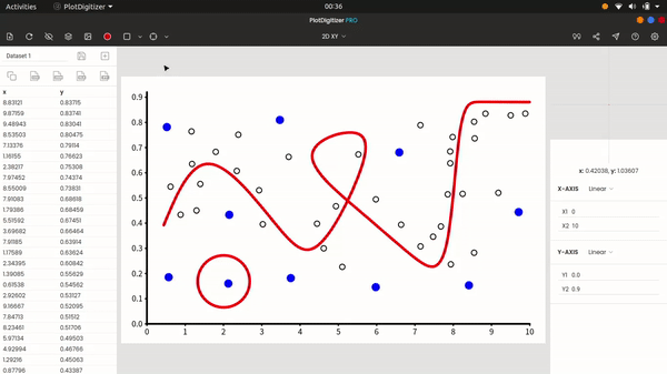
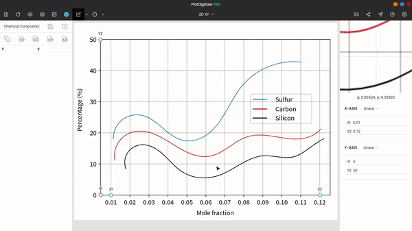
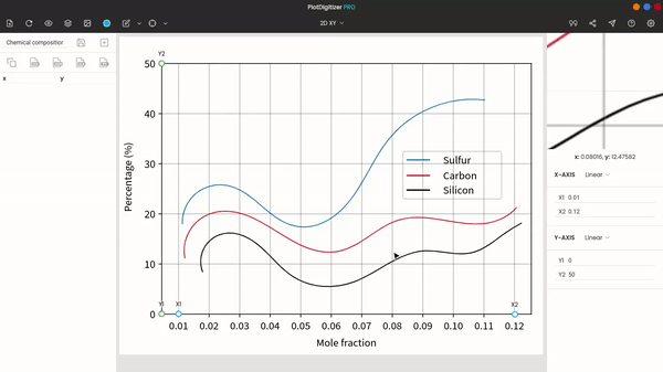
XY
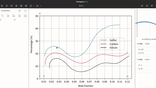
The XY graph is a standard 2D graph. And most users will be using this type. The graph is calibrated with horizontal X-axis (X1 and X2) and vertical Y-axis (Y1 and Y2).
The XY graph has numerous algorithms: cluster, points, curves, points & curves, and histogram. All these autotracing algorithms are discussed in the “Autotracing” section of this documentation.
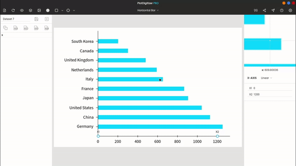
Horizontal bar
The horizontal bar graph has only a horizontal axis (X1 and X2). After calibrating the graph, you can use an inbuilt algorithm to automatically extract data values from horizontal bars, or you can manually extract the data. The autotracing feature comes in real handy when there are plenty of bars in the graph image.
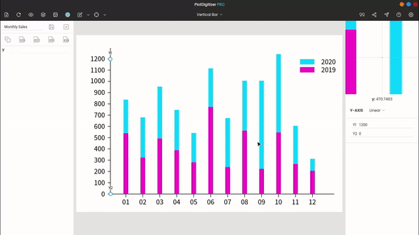
Vertical bar/column
The vertical bar graph has only one vertical axis (Y1 and Y2) to calibrate. You can also extract from column charts using the autotracing algorithm.
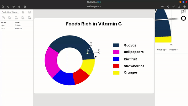
Pie/doughnut
The pie/doughnut is quite different from others. The data is visualized in a circular format, like a slice of pie. Each slice represents the percentage of an element.
To manually extract data from a pie/doughnut diagram, we require at least three markers: O, P1, and P2.
“O” is the origin; you have to drag-and-drop “O” to the origin of the pie/doughnut diagram. Then, place “P1” to one end of a pie and “P2” to the other end of the same pie. After that, you can see the percentage of pie “P1P2” in the dataset panel.
If you wish to display the data value in the fraction, instead of the percentage, you can change that from the scale panel.
You can continue to mark the other ends of other pies and their respective data values get generated in the dataset panel.
Also, you can move any marker anytime, the respective values get automatically updated. Moreover, you can group select multiple markers and move them by drag-and-drop or delete them with the right click of the mouse.
For doughnut charts, the origin is uncharted, so you have to guess the “O” marker initially. And then, readjust “O” after marking all slices as shown in the below image.
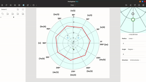
Polar
The polar diagram/ plot uses the polar coordinate system, instead of the cartesian coordinate system to represent data. To calibrate the polar graph, you need three markers: O, R, and ϴ.
“O” is the origin, “R” is a known radius, and “ϴ” is a known angle. Drag-and-drop the marker “O” to the origin of the polar diagram, “R” onto the position of a known radius, and “ϴ” onto the position of a known angle. After repositioning the markers, enter the appropriate values of R and ϴ in the input fields in the scale panel.
Depending upon the graph, you can select the angular direction: anticlockwise or clockwise.
After calibrating the diagram, you can start extracting the data. For quick extraction, you can use the autotracing algorithms.
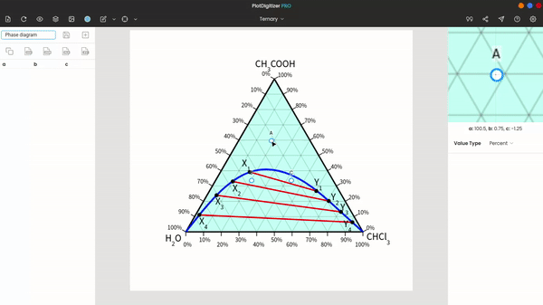
Ternary
Ternary diagrams are usually used to represent the composition of three different elements in the two-dimensional space. Though the equilateral triangle is most commonly used to represent the ternary system, with PlotDigitizer, you can extract data from any type of triangle, including the equilateral.
To calibrate the ternary diagram, place the markers (A, B, and C) onto the three vertices of the triangle. After that, you can start extracting data from the diagram. The percentage composition of A, B, and C are displayed on the dataset panel.
By default, the compositions are in percentages, but you change them to fractions if you want. You can also use autotracing algorithms to extract points and/or curves from the diagram.
Map with scale & distance
In distance, you can calculate the distance between any two points. The path between the two points does not necessarily have to be a single straight line; the path can be in multiple straight lines.
First, we need a reference distance. You can use the markers “P1” and “P2” to mark the initial and final position of the reference line. Then, enter the values of “P1” and “P2” in the scale panel. For example, if the reference distance is 40 units, enter “P1” as 0 and “P2” as 40.
Now, you can start marking the path. The distance of the path gets displayed below the zoom panel.
You can select and move or delete any markers at any time.
Angle
For angle, there are three markers: O, P1, and P2. “O” is the origin, while “P1” and “P2” are the endpoints of the two arms. The dataset panel displays two angles: P1P2 and its explementary P2P1. You can also switch the measurement unit from degree to radian.
Area
You can calculate the area of any region on the image provided a reference distance is known. For calculating the area, we need at least three markers. You do not have to enclose the region; it is presumed that the final marker terminates at the initial marker, enclosing the shape.
The calculated area is displayed below the zoom panel.
Also, you can select and move or delete any markers at any time.
Axis scales
PlotDigitizer accepts numerous axis scales.
Linear
The linear scale is the most common. In the linear scale, the distance between adjacent markers on the scale remains constant.

Date/time
Many a time, we visualize data on the date/time scale. Finding the precise values of off-grid points on the date/time scale is manually impossible. But with PlotDigitizer, you can extract any data plotted on the date/time scale in no time.
Further, PlotDigitizer Pro has an inbuilt date/time picker to ease data extraction. The dates/time are displayed in the international format (YYYY-MM-DD HH:MM:SS).

Log10
The logarithmic scale is very useful to represent data over a very large range. Log base 10 is the most popular.

Another is log base e, which is mentioned below.
Loge
Log base e or natural logarithm, like the previous one, is used to represent data over a large range.

Reciprocal
In the reciprocal scale, aka inverse scale, data is displayed on the reciprocals of numbers. The physical distance between adjacent markers decreases drastically as we move toward higher numbers.

Math parser
PlotDigitizer comes with an integrated math parser, which can parse and evaluate mathematical expressions. So, instead of entering the numeric value 6.28…, you can enter 2*pi. For power, we can use the exponent symbol “^”, for example, -0.000017 can be rewritten as -1.7*10^(-5).
The list of operators available in the math parser are as follows:
| Operator | Name | Syntax | Example |
|---|---|---|---|
| ( ) | Group | (x) | (12+23)*24 |
| + | Add | a+b | 3.4+0.22 |
| - | Subtract | a-b | 4.4-2.5 |
| * | Multiply | a*b | 7*3.5 |
| / | Divide | a/b | 2/5 |
| ^ | Power | a^b | 2^10 |
| ! | Factorial | a! | 7! |
The list of functions available in the math parsers are as follows:
| Function | Name | Syntax | Example |
|---|---|---|---|
| sqrt() | Square root | sqrt(x) | sqrt(12) |
| log() | Natural logarithm | log([number]) | log(10) |
| log() | Logarithmic | log([base], [number]) | log(10, 100) |
| sin(), cos(), tan()… | Trigonometry | sin(x), cos(x), tan(x)… | sin(30 deg), cos(2*pi/3), tan(45 deg) |
Trigonometric functions, by default, accept values in radians. For degrees, you have to add “deg” after the value, for example, sin(30 deg).
The list of constants available in the math parsers are as follows:
| Constant | Name | Syntax | Example |
|---|---|---|---|
| pi | pi | pi | sin(pi) |
| e | Euler's number | pi | 2*e |
Autotracing
Autotracing is one of the distinguishing attributes of PlotDigitizer. PlotDigitizer has numerous inbuilt algorithms to ease data extraction. It also allows users to extract many data points in a few clicks.
There are three simple steps in automatic data extraction:
- picking the right color
- adding the mask
- and selecting an algorithm.
Color picker
Color picking is the first step to autotracing. Click on the color picker icon on the top menu bar and select the desired color. Make sure you pick the right color; use the zoom panel while picking the color.
Masking
Masking is the second step. You have to add a mask to the desired portion of the image. The autotracing algorithms will only run on the masked portion.
There are two masks: pen and box.
Pen mask
The pen mask, as the name says, is like a pen. You can change the width of the pen mask by increasing/decreasing the slider next to it. A pen mask is convenient for curvy patterns and other irregular shapes.
Box mask
The box mask is useful when you want to apply a mask to a large portion of the image, for example, in scatter plots.
Erase mask
“Erase mask” is used to remove noises and undesired portions from the masked region. For example, you have applied a box mask to a graph image. And the masked portion contains the legend, which is unwanted. You can eliminate the region using the erase mask.
Clear mask
This option removes the mask.
Algorithms
PlotDigitizer has several algorithms, and they are as follows: Cluster, Solid Points, Hollow Points, Centroid, Curve, Skeleton, Outer Edge, Histogram, Vertical Bar, and Horizontal Bar.
Cluster
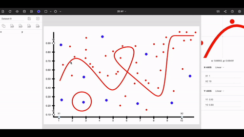
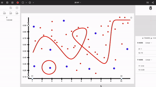
The "cluster algorithm" detects points of similar colors and groups them into small clusters. The algorithm can be used to extract data from solid-filled shapes.
Points (solid and hollow)
The point algorithm detects points (solid or hollow) from other shapes. Points do not necessarily have to be spherical.
Curves
This algorithm can detect curves and lines in the plot.
Point density: The slider next to the curve algorithm is the point density. It controls the number of points on the curves.
Centroid
This will give centroids of shapes
Skeleton
This will generate the skeletonized path of shapes
Histogram
Histogram algorithm is available in the XY graph. It is used to autotrace histograms.
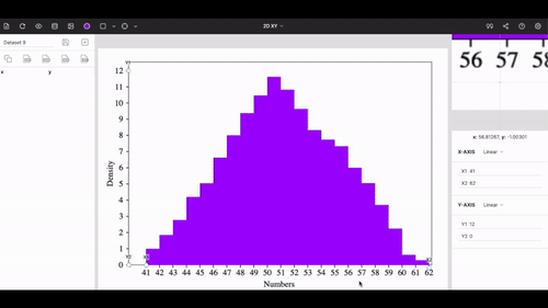
If the width of bars is very small, try reducing the thickness parameter.
Horizontal bar
The horizontal bar algorithm is available in the horizontal bar graph. If bars are of different colors then you turn them into one color by applying the grayscale filter from image editing.
Vertical bar
This algorithm detects vertical columns.
Color Tolerance
You can increase the color tolerance parameter if the color variation between the plot is large.
Note: If there are minor inconsistencies in the extracted data points while autotracing, you can always fix them by manually adjusting or deleting the data points.
Image editing
Since we are working with images, PlotDigitizer has some vital image editing features with it.
Image editing is accessible for the top menu bar.
Rotate
Graph images might not always be perfectly aligned. It may be tilted to some extent. We could fix it with the rotation tool.
To rotate an image, click-and-rotate on the rotation icon on the top of the image. After adjusting the image, you can save the image.
You can also use rotate icons on the bottom of the window.
Use the mouse scroll to zoom in/zoom out.
Scale
To scale the image, click-and-drag the bottom, right corner icon on the image.
Crop
To crop the image, click on the crop icon at bottom of the window. Then, resize and drag the cropping box and click crop bottom.
Cropping helps to remove the unwanted portion of the image, for example, titles and labels outside the plotting area. This is useful when you are uploading a scanned image file.
Flip
With flip icons, you can flip the image vertically or horizontally.
Filter
Color filters help to balance the color profile of the image when there are noises and distortions in the image, e.g., grid lines.
Grayscale
“Grayscale” converts the image to black-and-white. It must be used when there are undesirable color variations in the plot. Applying the grayscale filter removes different colors in the image.
Black track
“Black track” is an image filter. It turns the image into black-and-white and removes all soft-colored details in the image, especially, faded noises, grid lines.
Clarity
“Clarity” highlights details in the image. It is useful when points and curves are weak in color.
Sharpen
“Sharpen” is a standard image filter; it removes any blurriness in the image.
Invert
“Invert” literally inverts the color profile of the image, e.g., white turns to black.
Original
“Original” reverts the image to the original.
Datasets
In PlotDigitizer, you can store hundreds of sets of the extracted data.
Save dataset
To store a dataset, click on the "save" button on the dataset panel. Reminder: there is no autosaving. Every time you extract data from the graph image, you have to save it manually.
New dataset
To create a new dataset, click on the “new” dataset button, the next to “save” button.
View datasets
The saved datasets can be accessed from the “view datasets” option in the top menu bar. By default, the latest saved dataset is displayed on the popup window. You can retrieve the other saved datasets from the drop-down list.
Rename dataset
The saved datasets can be renamed by clicking the rename icon (pencil).
Delete dataset
To delete a dataset, click on the delete icon (cross).
Export
Often we want to further process the extracted dataset. So, PlotDigitizer offers multiple export options to its users.
You can export the extracted data in the following formats: CSV, JSON, Array, MatLab, MS Excel, Matrix, HTML table, Latex table, and TSV.
Before you export the extracted data, PlotDigitizer offers some simple reformatting features:
- Sorting: you can sort the data according to X, Y, or nearest. Nearest means the data is arranged according to the nearest distances. The sorted data can further be ordered ascendingly or descendingly.
- Digits: You can adjust the length or decimals of values. The “Fixed” option fixes the values to a specified number of decimals, rounding off the last digit. The “Precision” option converts the length of the values to a specified number of lengths, rounding off the last digit. Finally, the “Exponential” option converts the values into the exponential format.
Export formats
The list of export formats is listed below with a sample example.
Custom
The custom option allows users to use a custom separator to the separate values. Some examples of a separator are , (comma), ; (semicolon), : (colon), (space), etc.
CSV (Comma-Separated Values)
x, y
0.47, 0.31
0.89, 0.54
1.4, 0.62
JSON
[{"x": "0.47", "y": "0.31"},
{"x": "0.89", "y": "0.54"},
{"x": "1.4", "y": "0.62"}]
Array
x = [0.47, 0.89, 1.4]
y = [0.31, 0.54, 0.62]
MATLAB
xy = [0.47 0.31; 0.89 0.54; 1.4 0.62]
MS Excel
x, y
0.47, 0.31
0.89, 0.54
1.4, 0.62
Matrix
xy = [[0.47, 0.31], [0.89, 0.54], [1.4, 0.62]]
HTML table
<table>
<tbody>
<tr><th>x</th><th>y</th></tr>
<tr><td>0.47</td><td>0.31</td></tr>
<tr><td>0.89</td><td>0.54</td></tr>
<tr><td>1.4</td><td>0.62</td></tr>
</tbody>
</table>
Latex table
\begin{tabular}{ |c|c| }
\hline
x & y \\
\hline
0.47 & 0.31 \\
0.89 & 0.54 \\
1.4 & 0.62 \\
\hline
\end{tabular}
TSV (Tab-Separated Values)
x y
0.47  0.31
0.89  0.54
1.4 0.62
Settings
Zoom panel
This lets you change the magnification level of the zoom panel.
Transparency
Turn on/off the transparent background of the graph image.
High precision
Turning on the high precision increases the number of decimals in the output values.
Hardware accelerator mode
The hardware accelerator mode might improve the rendering and performance of the app.
Activation
To activate the app, enter a 25-character license key into the input field.
Note: The license key is valid for only one device at a time. To use the same license key on the other device, you have to first unregister from the first one. Frequent activation and deactivation can blacklist the key.
Reset
This option restores the app to its original settings and deletes all the saved datasets.