How to Extract Data from XY graphs?
We normally plot our data into a graph to show the relationship between different variables. And XY graphs are the most commonly used for data visualization. But sometimes, we might want to reverse-engineer graphs of others, supposedly because the raw data associated with the graphs is not available. This data extraction from graph images is not an easy process without the right tools.
PlotDigitizer.com is an online tool that supports several types of graphs, including XY. You can extract data without any time and export it to other file formats using PlotDigitizer.com.
Check out PlotDigitzer’s free online app.
Here are the simple steps for how to extract data points from an XY graph using PlotDigitizer.
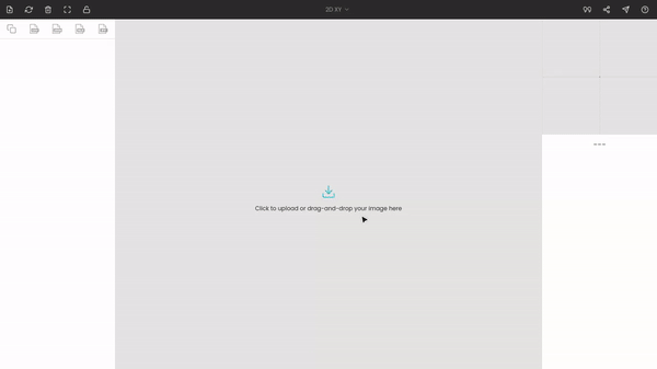
Step 1: Uploading the image
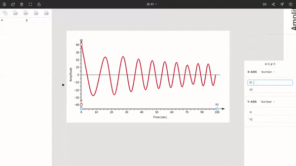
We will take the below graph as an example. The graph is a dampening curve whose amplitude decreases with time like an oscillating pendulum.
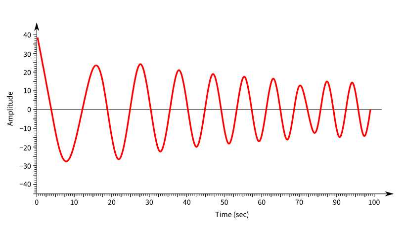
We want to extract the data points at maximum amplitudes.
Go to PlotDigitizer.com/app, and upload the graph image. PlotDigitizer accepts all common standard image formats, e.g., PNG, JPG, GIF, SVG, BMP, TIFF.
Step 2: Selecting graph type
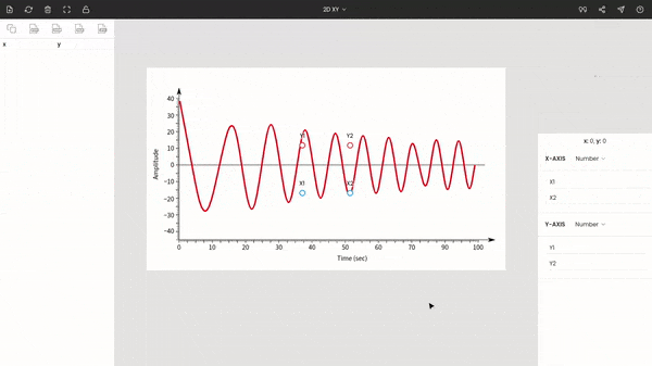
After uploading the image file, you have to select the graph type from the top bar of the window. In our cases, it is XY, which is the default selection.

If you are using the pro version, you can adjust the image using image editing tools. For example, if the image is tilted, you can fix it using the rotation tool. In the case of our example, the image is perfectly fine.
Step 3: Calibrating the axes of XY graph
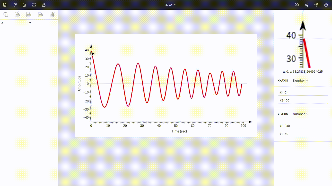
Once you choose the graph type to XY, you will see the points around the center of the window. These are x1, x2, y1, and y2. Drag and drop these points to the extremes of the plot.
Here x1 & x2 are dragged to 0 and 100, and y1 & y2 are placed at −40 & 40.
You do not necessarily have to move these points to the extremes, but it is recommended since it increases the accuracy of the calibration.
Enter the values of the points: x1 = 0, x2 = 100, y1 = −40, and y2 = 40.
The zoom panel on the right side displays the magnified portion of the image around the cursor. It helps to improve the precision of points while manually extracting data points.
Both the axes in our plot are linear. However, if either of the axes is nonlinear, say logarithmic, you could change the axes type to logarithmic from linear.
You can hide the points by clicking on the lock icon on the top bar.
Step 4: Extracting data points
Once the axes are calibrated, click the point on the image to record its coordinate. Here, we want amplitudes, so start marking all crests and troughs on the curve. Amplitudes and their times are stored on the left side of the window.
Step 5: Exporting to other file formats
You can export the extracted data to other formats, like CSV, MS Excel, MatLab, JSON, Array.