How to Extract Data from Pie Chart/Doughnut?
Pie charts are quite popular in the business, journalism, and technical world. They are used to represent the proportional relationship between different quantities. Every slice on the pie diagram stands for a quantity, and its sectorial area denotes the proportion of the quantity.
Though there are many variants of pie charts, the doughnut is prominent of all. In the doughnut chart, the center portion of the pie diagram is cut out, which may or may not be filled with some additional information.
Many a time, the percentages of quantities are not included in these diagrams and charts, like in the below example.
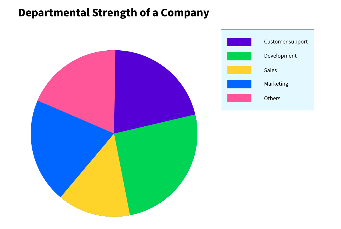
As we can see, the previous pie chart does not include the percentages of various departments on it. There is no simple way to find the strength of each department manually.
However, you can use PlotDigitizer to extract data from such diagrams. Moreover, PlotDigitizer also allows users to extract data from other varieties of graphs, such as XY, polar, ternary, bar, column. Also, you can calculate the distance, angle, and area of a portion on the image.
PlotDigitizer is freemium software. It offers a free online app with limited features and a pro version for offline usage.
Here are a few simple steps for extracting data from pie/doughnut charts:
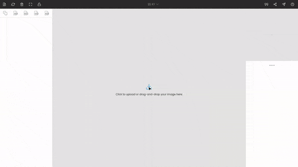
Step 1: Uploading the pie chart image
First, open the PlotDigitizer app and upload or drag-and-drop the chart image.
If you are using the pro version, you will have access to the image editing tool. It is helpful to do some minor fixes to the image, for example, scaling the image to a bigger size if the image is of low resolution.
Step 2: Selecting the graph type
The default selection is XY, so you have to change the graph type to pie/doughnut. You can achieve this from a selection menu on the top bar of the window.
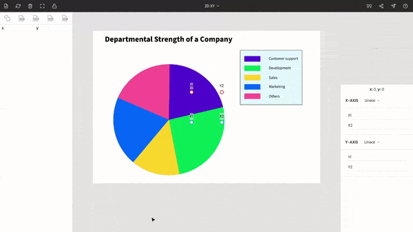
Step 3: Calibrating the origin
Once you switch the graph type to pie/doughnut, three points appear on the screen, of which one is the origin, labeled with “O.” Drag-and-drop “O” to the origin of the pie diagram. If the chart is a doughnut, then you have to approximate the origin of the chart.
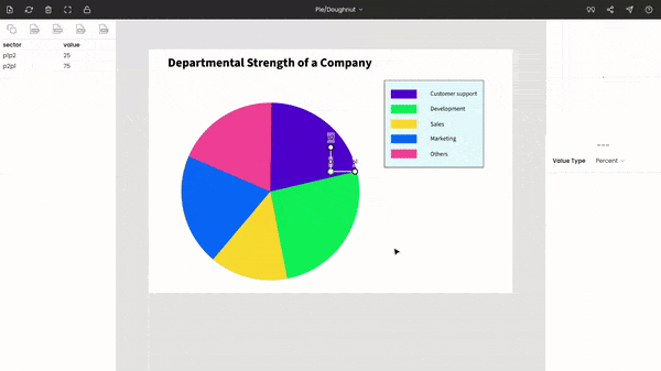
You can take the help of the zoom panel on the top-right side of the window to improve the accuracy.
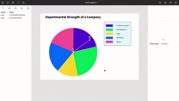
Step 4: Extracting data from the pie chart
Now, drag-and-drop the points p1 and p2 to the extremes of a pie. And for the rest of the pies, click the extremes points. The proportional of each quantity is recorded and displayed on the left side. By default, the proportions are in percentages, but you can change them to fractions.
The table below displays the proportional strength of all departments.
| Department | Percent (%) |
|---|---|
| Customer support | 21.3 |
| Others | 18.7 |
| Marketing | 20.2 |
| Sales | 14.2 |
| Development | 25.6 |
Step 5: Exporting the data to other formats
You can export the extracted data to other formats, e.g., CSV, MS Excel, JSON, MatLab.