How to Digitize Plot and Graph Images?
Graphs, Plots, and Charts are a very powerful way of communicating our research and presenting our data to our audience. They are used by people from all professions. People have tons of data to share, and they do it by creating intelligible visuals and graphics. Graphs and plots quickly let us know the trends and information that people want to communicate to us. For example, financial stocks are always published on websites in charts.
However, sometimes people want to extract the raw data from these visuals, i.e., reverse-engineer graphs and plots to retrieve the hidden numerical data. This process of reverse-engineering is called the digitization of data. In other words, you want to extract data from graphs and plots from a document. A document could be physical, like a paper or book, or it could be in a digital format, as a PDF.
This is especially true for people from research and engineering backgrounds. Individuals from scientific fields often have to deal with plots and charts. And most times, they heavily rely on others’ work and research. To extract data from others’ graphs is not a pleasing experience. It consumes time and effort.
PlotDigitizer is one of the best tools on the internet that eases data extraction from graph images. You can extract data from graphs and plots with only a few simple steps using PlotDigitizer. PlotDigitizer supports several types of graphs: XY, bar, column, pie/doughnut, polar, ternary, & maps. Moreover, you can calculate the distance between two points, angle between two lines, and area of an irregular polygon on the image using PlotDigitizer.
PlotDigitizer is freemium software. It offers a free online app that is efficient enough for data extraction; you can check it out here. For offline usage and more functionalities, like automatic point detection, you need to upgrade to the pro version.
Here are simple, easy steps for digitizing graph & plot images using PlotDigitizer:
Step 1: Scanning the plot or graph to create the image
For a physical document, you have to scan the page on which the graph is there. Or, if your mobile phone has a good camera, you can capture a photo. Make sure the graph is photoed flat.
In the case of a digital document, you can take a screenshot of the page. Different operating systems have slightly different procedures.
For Windows users, the screenshot can be taken with the in-built snipping tool. Open the start menu, search for “snipping tool.”
For macOS, the shortcut for capturing a portion of the screen is “Shift+Command+4.”
For Ubuntu, the shortcut is “Shift+Prtscn.”
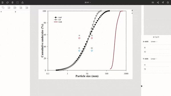
As an example, we have picked a random publication from Elsevier.

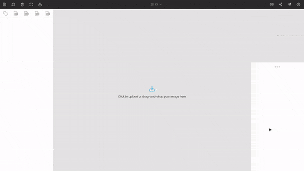
Step 2: Uploading the plot or graph image to PlotDigitizer
After creating a digital photo of the graph, you have to upload the image file to PlotDigitizer. The image can be uploaded by clicking on the upload icon or by drag-drop.
PlotDigitizer accepts all common image file formats, e.g., PNG, JPG, GIF, SVG, TIFF, BMP, JPEG.
Step 3: Editing the image
If you are using the pro version of PlotDigitizer, you can access the image editing features. This toolset comes in handy when the image is not properly aligned. For example, you can rotate the image to make it orthogonal with the screen, or you crop out an unwanted portion of the image, like titles, labels.
If your image is perfectly fine, like in the case of our example, you can skip this step and move to the next.
Step 4: Selecting the type of the graph
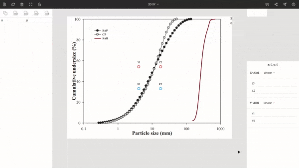
After uploading the image to PlotDigitizer, you have to select the type of the graph, which is XY in our example. This can be achieved from a selection menu from the top bar.
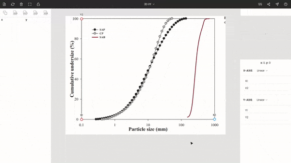
Step 5: Calibrating the graph
The graph can be calibrated by calibrating the individual axes.
This step will vary slightly depending upon the type of graph you have selected.
For the XY graph, there will be four points on the screen: x1, x2, y1, & y2. Move these points to the extremes of the graph. Here, x1 & x2 are moved to 0.1 & 1000, and y1 & y2 are drag-drop to 0 & 100.
You do not necessarily have to move the points to the extreme. For example, x1 can be placed by 1 instead of 0.1. But the extremes are recommended since it increases the accuracy of the calibration.
You can use the zoom panel (magnifier) while manually placing the points.
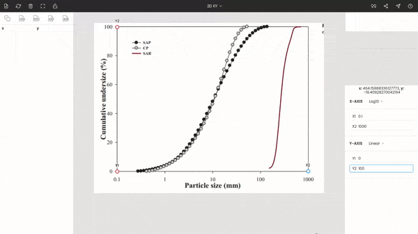
In the graph, the x-axis scales from 0.1 and 1000, and it is logarithmic. On the other side, the y-axis is a simple linear scale that goes from 0 to 100%.
Now, enter the appropriate values of the points, and select the type of axes.
Finally, we have calibrated the graph. You can see the coordinates of the cursor below the zoom panel as you hover over the image.
Step 6: Extracting the data from the plot or graph image
In the image, there are three curves. Let us assume we want to digitize the steep red curve from the graph.
We can extract the numerical data from the plot by simply clicking on the curve. The extracted data get displayed on the side panel.
Step 7: Exporting the extracted data
The extracted data can be exported to various formats, such as CSV, MS Excel, MATLAB, JSON. Here, we are exporting to MS Excel.
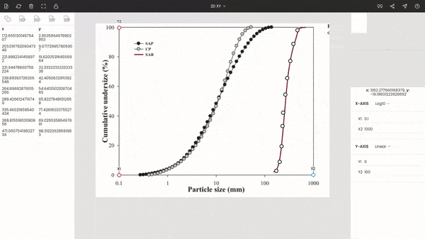
Repeat the above steps for the rest two curves.
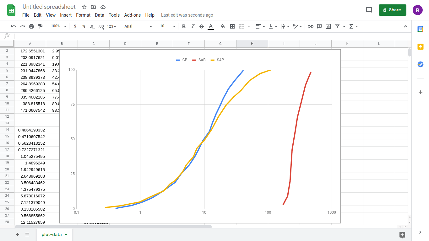
Step 8: Replotting the extracted data in MS Excel (or Google Sheets)
In the end, you can import all the extracted data into your favorite plotting software, e.g., Excel, MATLAB. And replot the extracted data. While replotting, make sure you maintain the consistency with the graph scales, i.e., the axes ranges and axes type should be the same. Here, the x-axis is logarithmic and its range is from 0.1 to 1000.
Below the screenshot is of Google Sheets.